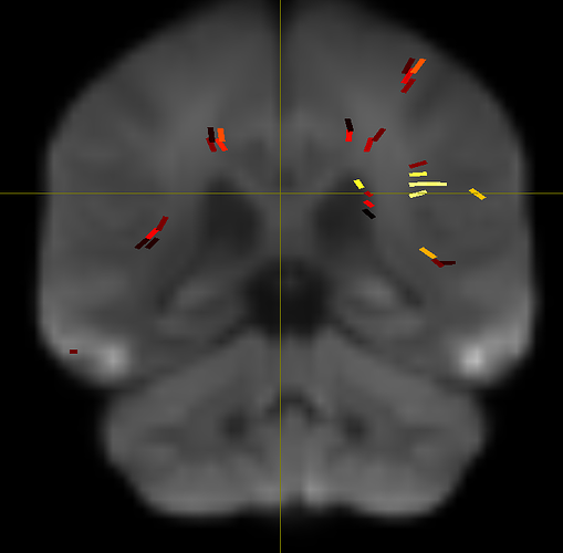
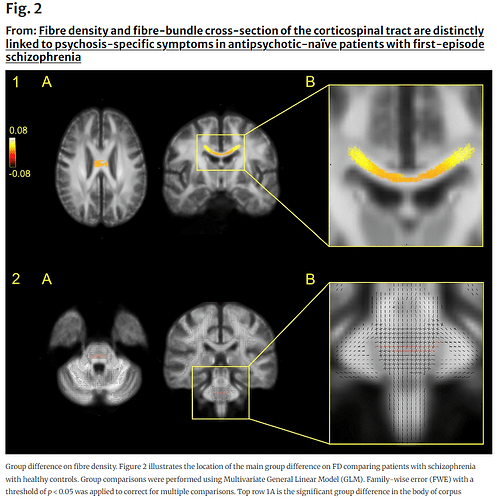
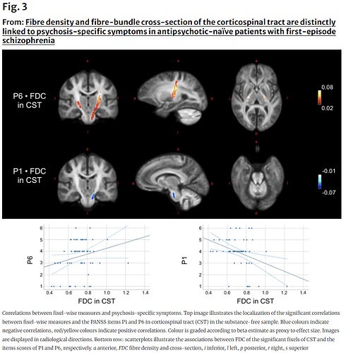
Hi all, I’m a grad student new to imaging visualization and I need some help. I’ve followed this guide to fixel based analysis and got some great results! However, I need some assistance in figuring out how to translate what I’m seeing in Mrview to a 2D figure for publication. Specifically, I had 2 main points I wanted to ask about in order to make figures similar to figures 2 and 3 in this article. Firstly, how do I actually get a scatter plot of correlations between FDC and my variable of interest from mrtrix? Or at least the data from the fixels to make those scatterplots? Secondly, how can I turn these significant fixels into ~aesthetically pleasing~ figures that might make some more sense? I’ll upload an example of where I’m at right now as well as the figures I’m more or less trying to replicate. Thank you all so very much for any help you can give!
Hi Ivan,
Here is a potential plan of attack
- get a fixel mask of the region (for example, CST). This can be computed using
tck2fixel $TractSeg_region_tck $fixel_directory_in $fixel_masks_dir $Region_fixel_mask(assuming that TractSeg was used to generate the CST bundle). - compute the average FDC metric for each subject in the region. This can be done using
mrstats <FDC_subject#.mif> -mask $Region_fixel_mask. To print out only the mean, consider adding in the option-output mean. Loop through the subject list and print (and append) the output to a text file (along with the subject label).
See here and here for more information on this topic ![]()
Cheers,
Arkiev
1 Like


