Hi all,
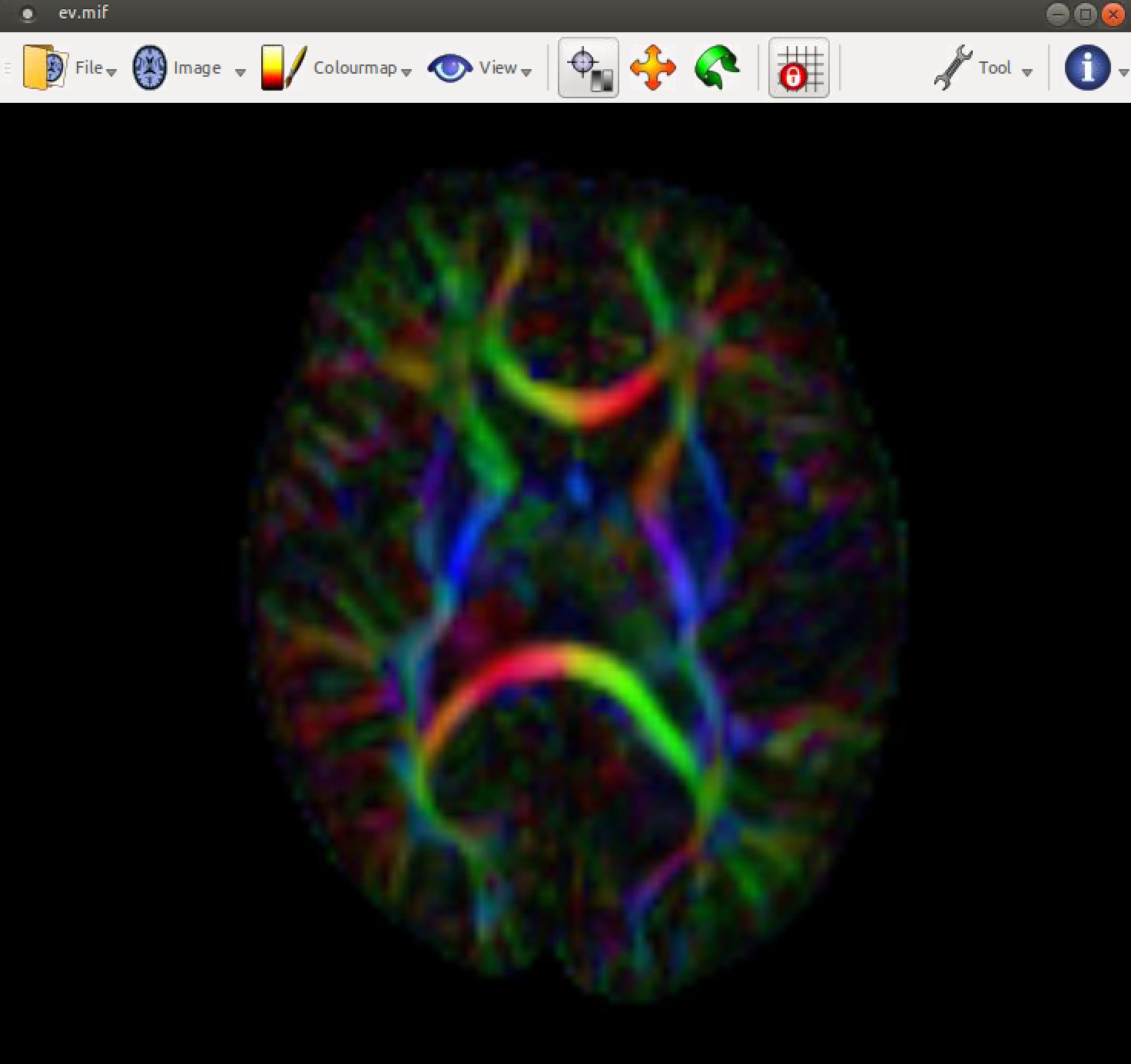
I’ve been having problems for some diffusion images when I run them through dwi2tensor and tensor2metric to create colour coded maps. The maps come out looking wrong:
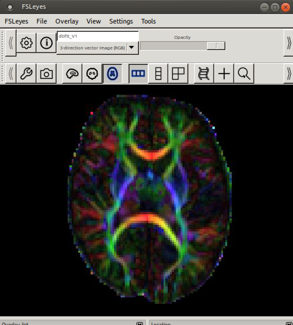
I have this problem when I convert the dicom data to .mif using mrconvert and run it though dwi2tensor and tensor2metric, and also when I firstly convert the dicom data to nifti using dcm2niix and then run it through dwi2tensor and tensor2metric. However when I pass the niftis through FSL’s dtifit, the colour-coded maps look ok:
So there seems to be some specific problem with MRtrix reading the data. I’m not sure what could be causing this issue and I wondered if anyone could provide any advice on things to check or possible solutions. I received the dicom data from a different site. It was acquired with a Siemens Skyra. I wondered if there could be a problem with anonymising the dicom data as mentioned in this previous post (Diffusion Gradient Information Philips Acheiva). Since I received the dicom data from a different site I’m not sure what the process was to anonymise the dicom data.
If anyone is able to provide any help that would be greatly appreciated. Let me know if I can provide anymore information.
Many thanks,
Claire
They might not be wrong actually (though you’re entirely right to worry whether they are in this extreme case!). The colours in these maps, as well as the orientations of the eigenvectors themselves are defined with respect to the world/scanner coordinate system. If this is the explanation for this dataset, then the difference with FSL’s dtifit here and subsequent colour map in FSL is also sensible: in FSL, a lot (if not all) things are done with respect to the image (voxel) coordinate system.
We can check this directly, to make sure there’s nothing wrong otherwise. When you loaded the ev.mif image in the first screenshot, can you add these 2 things:
The orientation labels. I suppose you hid all label/info type of stuff to make the image more clear to to anonymise further, but the orientation labels specifically here are helpful to put the colours in context. After hiding all the other stuff with the space bar, you can show the orientation labels (only) again via the “View” menu, or directly by pressing the “O” key on your keyboard. If you imagine connecting the orientation labels by 2 lines (A with P, and L with R), you can see the world coordinate system. My guess / hope here is that it sits at a substantial angle. The colours are relative to that then: red is indeed left-right, but with respect to the L and R labels in world space.
Load the same ev.mif image also (additionally) via the Fixel plot tool. If the orientations of the vectors themselves align with the anatomy, this would also confirm that everything is actually correct, but indeed due to a world coordinate systems that sits at quite an angle.
I’ve recently emailed to someone else (very close to us ) who ran into the exact same scenario actually. I’ll forward and include you in the email conversation. Depending on what you need or want to generate here e.g. for visualisation, there’s a few different solutions. I’ll help you out offline; there’s a couple of tricks that might apply here.
I would like to double-check my understanding based on this discussion.
I have a subject acquired with an oblique head position (“ImageOrientationPatientDICOM”: [0.9, -0.41, 0.034, 0.4, 0.88, 0.22]). The diffusion data were converted with dcm2niix and then converted to .mif with mrconvert and processed using a standard MRtrix pipeline (denoising, degibbs, motion/eddy correction).
I observe an asymmetry in the colour FA map as in this discussion. The red seems indeed to be left-right with respect to the L and R labels in world space and the orientation of the vectors themselves align with the anatomy.
Am I correct in understanding that there should be no need to adapt the processing specifically because the head was not “straight” in the scanner and that I can used my FA and others metrics ?
You are correct. You generally do not need to adapt your processing specifically because of the oblique acquisition, and your FA and other scalar metrics are valid to use.
The asymmetry you are observing in the Directionally Encoded Color (DEC) map is a visual artifact of the head rotation, not a data error.
The colors are assigned based on the primary diffusion direction relative to the scanner’s physical axes (World Space):
Red: Left-Right (Scanner X-axis)
Green: Anterior-Posterior (Scanner Y-axis)
Blue: Superior-Inferior (Scanner Z-axis)
Because your subject’s head is rotated (oblique) relative to the scanner, the white matter tracts that are “Left-Right” anatomically (like the Corpus Callosum) are not perfectly aligned with the “Left-Right” scanner axis.
Scalar metrics like Fractional Anisotropy (FA) and Mean Diffusivity (MD) are rotationally invariant.
These metrics are calculated from the eigenvalues of the diffusion tensor.
The eigenvalues represent the shape and magnitude of diffusion, independent of its orientation in space.
You mentioned: “The vectors themselves align with the anatomy.”
This is the most critical quality control step. If you view the ODFs (Orientation Distribution Functions) or the principal eigenvectors (the “sticks”) overlaid on the anatomy, and they follow the white matter tracts correctly (e.g., pointing along the corpus callosum rather than cutting across it), then your gradients are (most likely) correct.
 ) who ran into the exact same scenario actually. I’ll forward and include you in the email conversation. Depending on what you need or want to generate here e.g. for visualisation, there’s a few different solutions. I’ll help you out offline; there’s a couple of tricks that might apply here.
